Logged Out
Create an Account
Login:
Password:

Forgot your password?
Title page text for main menu and forum

Title page text for main menu and forum
[Back to Index]
Thread Tags
Primary: [Support]
Secondary: None

Chops is it possible for me to get rid of the text for the title to the Main page and the forums?

Im talking about the text above the News in the frame on the front page. Also the one that says Forum when you click forums.

Ive come up with drop down menus and was planning to put them in the that top border.

Weird thing is I changed it from it saying News and I cant find the code now.

Its the Glass template thats been modified
Take a look in the layout.html file for <!--System:Title-->. You can just take that out, and it'll go away, then replace the stuff there with the drop down menu you're talking about.


--
It's all in the reflexes.
Thank you Chops ) Worked like a charm
Quick Recommendation for your top bar, since Widescreen monitors are so common: Try to extend it a bit more, as it cuts off (see screeny).


--
It's all in the reflexes.
Weird! What browser are you using?

Ive got ie 7 and firefox and its not doing that. Maybe its at a certain resolution?

Im at 1280 x 960


It's firefox. It has to do with the wide resolution. My main monitor is 1680 wide, and my laptop and 2nd monitor are 1440 wide.

Pretty much any newish 19" widescreen monitor will be running at least 1440 wide, which should be the minimum your image should stretch to, imo, though 1650 is probably a better idea, since almost all 21" monitors will run that.

That said, I've had a few customers call to complain about resolution issues with templates when they're running full 1080p (1920 wide), and at least one customer running 2500x1900.


--
It's all in the reflexes.
Quote by Chops
It's firefox. It has to do with the wide resolution. My main monitor is 1680 wide, and my laptop and 2nd monitor are 1440 wide.

Pretty much any newish 19" widescreen monitor will be running at least 1440 wide, which should be the minimum your image should stretch to, imo, though 1650 is probably a better idea, since almost all 21" monitors will run that.

That said, I've had a few customers call to complain about resolution issues with templates when they're running full 1080p (1920 wide), and at least one customer running 2500x1900.


I will mess with it over the weekend when there is more time. As I recall when the banner was extended on my screen it pushed out the menus on the right side and had to scroll the main windows tab to see the whole page. this might be a issue.

I am a noobie at coding but having fun at it


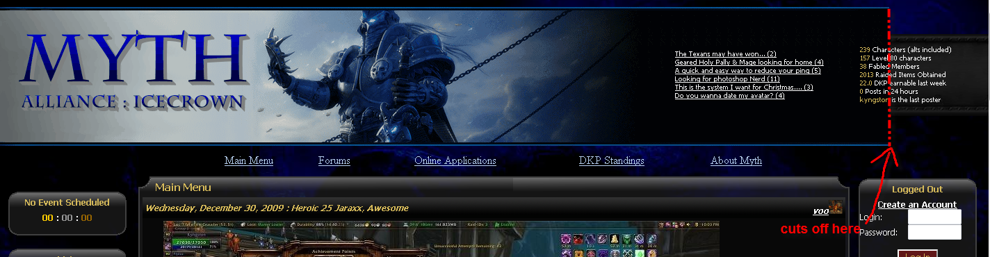
That's true, if it's massive, it'll force the page to have a horizontal scrollie, and no one ever wants that.

If you're feeling adventerous, here's an option for you.

Break the image up into two parts, the main part, and the black part off to the right (the part that you just have repeating). For this example, I'll call them main.png and repeat.png.

Then, you can remove the reference to <!--System:Logo--> in the layout.html file, replacing it with a pair of divs

<div class=logowrapper>
   <div class=logo onclick="location.href='news.php'"></div>
</div>


Remember, that goes were the old Logo was. The "onclick" part is just for making the logo be a click-back to your main oage.


Then, in your CSS, you would define it like this:
.logowrapper {
position:absolute;
left:0;
width:100%;
top:10px;
height:200px;
background-image:url(http://dkpfiles.com/myth/files/repeat.png) repeat-x;
}

.logo {
position:absolute;
left:0;
top:0;
width:700px /* (or however wide your logo is) */
height:200px;
background-image:url(http://dkpfiles.com/myth/files/main.png) no-repeat;
cursor:pointer
}


Something like that. You'll likely need to tweak it a bit, but for the most part, that should take care of it. And the logowrapper will ensure that the top-bar repeats for however large of resolution a user has.


--
It's all in the reflexes.
Thank you Im definately going to do this. A thought was to start over on the banner and site to do a cataclysm theme. Thats the new expansion due to hit in a few months.

Getting back to what you was saying about wide screen monitors. Ive noticed something about sites. The background image can be as large as 2600x1400 yet theres no scroll bar. Im at 1280 x 960. Im confused how this works. There's got to be a way to force a browser not to scroll thru html or css code. What keeps going thru my head is to make all the code center everything so no matter the resolution menus and graphics are in the middle of the screen.

I do have a big question for you not related to the banner. Im in the planning stages of changing things around and I need know if
stuff is possible.

The side menus.. these are fixed from the top? all menus fall below the top one? What Im after is I want to 86 the system timer and move the left menus up. I want to get rid of the big gap between the banner and the first top left menu.

Ive had some big ideas and looking around at the top guilds websites they are usually very clean and simple. lately Ive been messing with something you and others might be interested in.

Totally free drop down menu creator
http://www.coffeecup.com/free-dhtml/

My plans are to eventually get rid of the side menus and put a drop down which is already created on my test html. 86 alot/all of the side menus. Id like to see graphics on the sides.

Ideas like horizontally somewhere put the progression icons so when you hover over them it displays whats been killed. You can do the same with the recruitment icons. I think adding a box(maybe popup) between the banner and the news screen would be the ticket for some of this stuff. Maybe in that same box put the last threads vent etc.

A simple login prompt with name a pass and after you are logged in a options button to hide all the extra options.

Clean and simple without sacrificing funtionality is the concept. Honestly I think people are looking for this these days.

Sorry Ive made the a wall of text, just had to get some ideas out


I worked a bit tonight and figured out the menu gap thing and the banner.

With the banner I took out the banner code completely and just simply pasted the banner on the background image which is static and centered. I did that at 1600 x 900 fixed and no scroll problem anymore.

Its not live.. all on my test stuff


[Back to Index]